PACKAGING EXPERT BAY AREA
Air Hogs Packaging

All of the Air Hogs packaging shown was done while I worked for Spin Master in their Toronto office. A small tight group of nutjobs and an insanely entrepreneurial spirit, which is why I fit in so well! Most of these projects were collaborations with my Canadian bro, Mike Arnott.

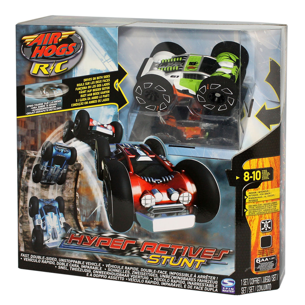
Key feature was the "bottom" of the car. Basically it had two tops so the vehicle could drive on either side. I revealed the feature with a reflective panel.

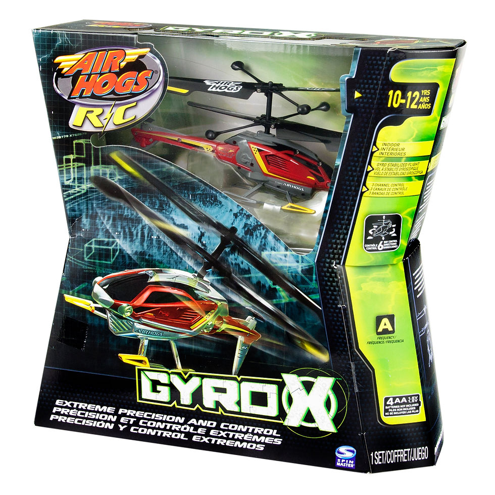
The product name defined the shape.."X". I had just finished the Cars 2 packaging so that Chevron shape got mirrored and I had my X. Just had to add the Air Hogs Brand Side Bevel and Robert's your Father's Brother.

One of the last two packages I was working on before I went to LeapFrog. Higher quality product inspired moving to a structure that is more associated with Consumer Electronics to communicate the value/quality promise of the product.

There's my triaxial packout again. Not happy that we used it here though. I don't think the main product feature of being able to drive on walls is communicated well by the structure and packout. We fixed it in later Zero G versions.

Packout options were limited given the geometry of the vehicle and new controller plus package size restrictions. The vehicle needed to be the hero and the controller had to be appear secondary in importance in spite of its mass. The main feature of the vehicle that flipped the vehicle back up after a rollover looked like packaging material. Solved by graphics and securing vehicle with minimally visible packaging materials.

I enjoy the challenge of building structures per Disney Style Guides. The guides are solid creative visions that are challenging, success is measurable and you have the freedom to focus engineer efforts on DFM and DFA.

I like it when a graphic designer has a specific shape in mind for a package, I have fun solving the best way to manufacture something that is a little different.

An alternate structure for a product that was relatively small for the price point. The VUF Cover adds to the value perception and all branding elements were sufficiently upheld.

Another of the last Air Hogs I worked on for Spin Master. Porthole window and oblong structure gave a fun and high value presentation.